
|
Probably the best advice anyone ever gave me about writing advertising copy came in a job interview when I was first starting out in New York. It went something like this: |
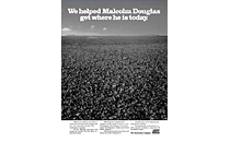 |
Ampol |
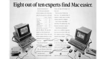 |
Apple Computer |
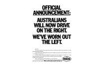 |
Australian Automobile Association/Petrol Tax |
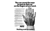 |
Avis Car Rental |
 |
CityRail |
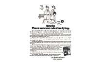 |
Fairfax/National Times |
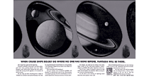 |
Fantasia Information Services |
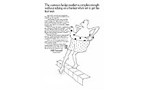 |
Hill Samuel |
 |
ICI Botany |
 |
New Children's Hospital |
 |
NSW Datsun Dealers |
 |
Swissair |
 |
Tooheys Flag Ale |
 |
Xerox copiers |
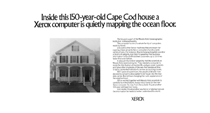 |
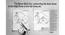
Xerox computers |
|
If you'd also like to listen to my radio work, just click Radio. To see to my TV commercials, click TV. And to check out previous Print Ads, click Archives. |